In this post, I would like to discuss several ways how to create onboarding/introduction screens for your app. Let me keep aside the discussion if such screens are good UX pattern, but let me rather examine SwiftUI capabilities for such task instead.
The task
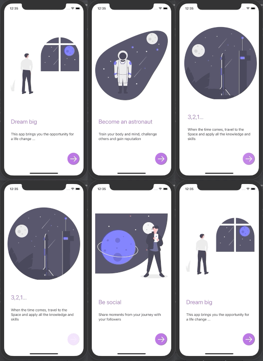
The task for today’s SwiftUI exercise is simple. We would like our app to have N onboarding pages which our user can browse through at the first app launch. Browsing can be made either with a swipe gesture or by pressing the next button.
Something like this:

IntroPageView
We will start with the preparation of a single view that contains an illustration, the title, and description. It is a basic View, you can notice that I like to use a combination of stacks and Spacers for easy alignment of the subviews.
struct IntroPage {
    let imageName: String
    let title: String
    let description: String
}

struct IntroPageView: View {
    let page: IntroPage
    var body: some View {
        VStack {
            Spacer()
            Image(self.page.imageName)
                .resizable()
                .aspectRatio(contentMode: .fit)
            Spacer()
            Group {
                HStack {
                    Text(self.page.title)
                        .font(.title)
                        .foregroundColor(.purple)
                    Spacer()
                }
                HStack {
                    Text(self.page.description)
                    Spacer()
                }
            }
            .padding()
        }
    }
}
Using TabView
If you are familiar with UIKit, you would most probably look for a Scrollview with set property isPagingEnabled = true to start with. Unfortunately, SwiftUI does not have the exact counterpart, but that does not mean, there are no solutions for our case. Of course, one can use UIScrollView based component and wrap it using UIViewRepresentable to SwiftUI, but let me focus on pure SwiftUI solutions only.
Since the recent SwiftUI update, often denoted as SwiftUI2, we can use TabView for our purpose. Even though TabView is mainly purposed for Views organized in Tabbar, applying .tabViewStyle(PageTabViewStyle()) creates exactly what we would expect from a paginated scroll view, it even creates a paging indicator at the bottom of the view!
(To remove or customize paging indicator appearance, set .indexViewStyle(PageIndexViewStyle()) appropriately ;)
struct ContentView: View {
    let pages: [IntroPage]

    @State private var currentPage = 0

    var body: some View {
        VStack {

            TabView(selection: $currentPage) {
                ForEach (0 ..< self.pages.count) { index in
                    IntroPageView(page: self.pages[index])
                        .tag(index)
                        .padding()
                }
            }
            .tabViewStyle(PageTabViewStyle()) // the important part

			// NEXT button
            HStack {
                Spacer()
                Button(action: {
                    withAnimation (.easeInOut(duration: 1.0)) {
                        self.currentPage = (self.currentPage + 1)%self.pages.count
                    }
                }) {
                    Image(systemName: "arrow.right")
                        .font(.largeTitle)
                        .foregroundColor(Color.white)
                        .padding()
                        .background(Circle().fill(Color.purple))
                }
            }
            .padding()
        }
    }
}
Nice, clean, and easy. There is only one drawback - this works on iOS14 only… So what if you want/need to support iOS13 as well?
PagingScrollView based on HStack
As already mentioned, the standard Scrollview in SwiftUI has very limited capabilities compared to UIScrollView. It is not possible to enable pagination and prior to SwiftUI2 it was also impossible to scroll to a specific subview. (Now you can use ScrollViewReader for that purpose, but again - supported on iOS14 only)
A bit harder way but with plenty of freedom is to take HStack and implement the scrolling using gesture recognizers. With this approach, you had to work with stack offset and change it according to user actions. You can inspire and/or directly use the component SwiftUIPagingScrollview that I have prepared and is available on Github. The interface is far from ideal as it requires messing with GeometryReader, but for illustration:
GeometryReader { geometry in
	PagingScrollView(activePageIndex: self.$currentPage,
					 itemCount: self.pages.count,
					 pageWidth: geometry.size.width,
					 tileWidth: geometry.size.width,
					 tilePadding: 0) {
    	ForEach (0 ..< self.pages.count) { index in
        	IntroPageView(page: self.pages[index])
        }
   	}
}
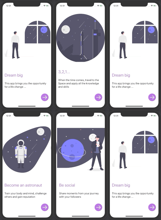
This solution gives us great scrolling experience:

Transitions and id modifier
If you are not very strict about direct scrolling with your finger, an interesting approach is to use custom transitions that simulate the scrolling animation. The transitions are being triggered when views are being added or removed from the view hierarchy. You can create any fancy and asymmetric transition using composition of viewModifiers, but for now we will be OK just by combination of standard moving transition, like this:
extension AnyTransition {
    static var pageTransition: AnyTransition {
        let insertion = AnyTransition.move(edge: .trailing)
            .combined(with: .opacity)
        let removal = AnyTransition.move(edge: .leading)
            .combined(with: .opacity)
        return .asymmetric(insertion: insertion, removal: removal)
    }
}
Please note that I have added there also opacity change just for the fun and demonstration of transition combinations.
Now, to setup several pages with transitions one could write something like this:
Group {
	if 0 == self.currentPage {
    	IntroPageView(page: self.pages[0])
    }
    if 1 == self.currentPage {
    	IntroPageView(page: self.pages[1])
    }
    if 2 == self.currentPage {
    	IntroPageView(page: self.pages[2])
    }
    if 3 == self.currentPage {
    	IntroPageView(page: self.pages[3])
	}
}.transition(AnyTransition.pageTransition)
As you see, that is not very nice and scaleable. (But note the usage of Group view that sets the transition to each of its subviews)
Much nicer and more elegant solutuon is to use identity modifier id like so:
IntroPageView(page: pages[self.currentPage])
	.transition(AnyTransition.pageTransition)
	.id(self.currentPage)
Nice, right? Whenever assigned identifier changes, the view is being replaced with the new one and thus transitions are triggered both for the old view (removal) and new view (insertion).
Summary
Today I have tried to present several ways of building up onboarding screens in SwiftUI. I have examined three approaches that can satisfy most of the use cases - at least I believe so. Let me review them once again:
Use TabView
➖ iOS14 only; low coolness factor (can be tweaked with parallax effects though); cannot set animation style to tab change
➕ quick and easy
Implement custom Scrollview based on HStack
➖ non-trivial implementation; mixing with other scrollable components might lead to issues
➕ ability to fine-tune everything; great scrolling feeling
Use just transitions
➖ no way to mimic true scrollview behavior (if you need it)
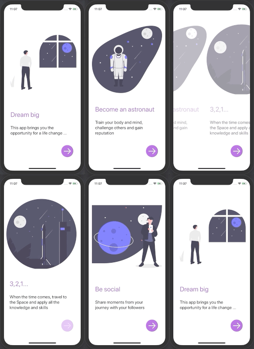
➕ clean and easy; you can go crazy with custom transitions, like the one below. But that is for another story and my next blog post 😉.

